The polling website where Republicans are winning in a landslide | #206 - October 9, 2022
A math and history lesson on why "unskewing" the polls is so hard
Happy Sunday everyone,
Over the weekend, a new series of charts appeared on the webpages of RealClearPolitics.com, the right-leaning news aggregation website that also hosts averages of polls for upcoming elections. These site has been publishing averages since the early 2000s, and while they used to be a pretty comprehensive and fair collection of polling data I should note that the people in charge have routinely made some very arbitrary methodological decisions that have tended to have the predictable effect of skewing their numbers toward Republicans. This is why I have advised people to take their numbers with a grain of salt.
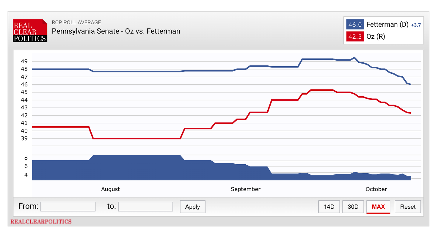
But the site’s new set of featured graphs makes me question altogether their broader commitment to creating comprehensive and unbiased aggregates of polls. Go to their webpage for the upcoming Pennsylvania Senate race and you will see two charts. The first is their usual average of polls, showing the shares of the vote they think John Fetterman and Mehmet Oz would win if the election were held today, according to their poll-aggregating methodology:
RealClearPolitics (hereon “RCP”) calculates these averages by taking a simple moving average of polls conducted over the last few weeks. (Note that the time window they use to include or exclude polls is not constant across races, and has in the past been adjusted from day to day to exclude more pro-Democratic polls. This is the main criticism in the above links on their lack of credibility.)
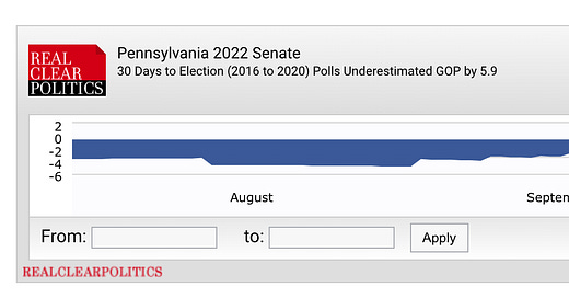
Below that familiar chart, however, is the following new graph:
It is a bit hard to make out what’s going on at first, so here’s the blow-by-blow. RCP is taking the Democratic margin in their aggregate (the first picture) and subtracting their estimate of the bias in the polls at this point in the 2016 and 2020 elections. For instance, they estimate polls at this point in past cycles have tended to overestimate Democrats by 5.9 percentage points, so they subtract that amount from Fetterman’s 3.7-point lead in their average and get an “adjusted poll average” of Oz +2.2.
They repeat this process for other competitive Senate races and show the results in the following table:
Let me take a brief segue and commend the designers of this table for packing a remarkable amount of information in a tight space. It reminds me a lot of the density of information from the original FiveThirtyEight website. You get to see current poll averages, previous poll averages, adjustments being made and the results of those adjustments all in the same place. It’s a good table.
But there is a big, big problem with the way RCP is calculating these adjustments—and, really, with this exercise altogether. The error is large enough that it has the potential to mislead millions of readers, and bias our whole conversation about the polls. That big issue boils down to this statement:
Over the past 20 years, bias in the polls in one election cycle has not been predictive of bias in the polls in subsequent cycles.
The error RealClearPolitics is making (intentionally, I think—and I’ll explain why) is in asserting that they can predict bias in the average of polls ahead of an election. They assert, statistically speaking, that they can do this by looking at the average error in their average of polls in each state over the past three election cycles.
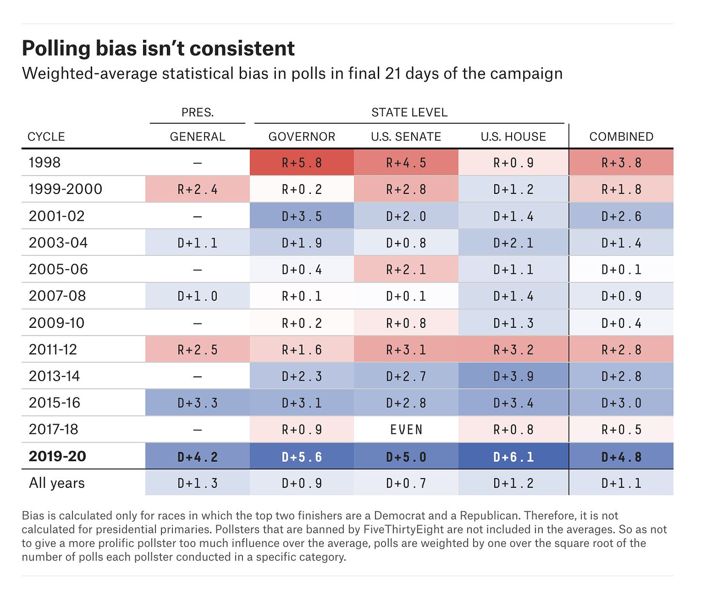
But you do not have to go back very far to see that this is not true. If you had tried to predict the bias in Senate polls in 2014 by averaging the bias in the polls in 2008, 2012 and 2014, for example, you would have predicted that polls were underestimating Democratic candidates’ margins of victory nationally by 1.3 percentage points. Yet in reality, the polls that year ended up overestimating the Democrats by 3 points:
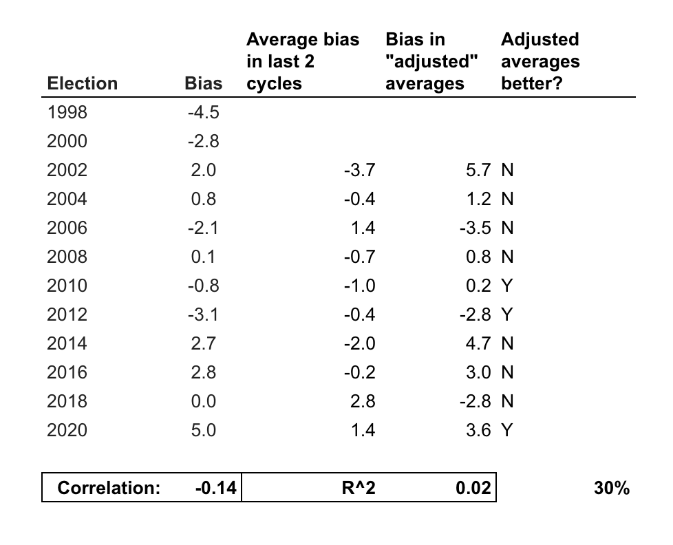
Similar inversions in average error also happen from 2000 to 2002; from 2004 to 2006; 2006 to 2008; 2008 to 2010, 2012 to 2014; 2016 to 2018; and 2018 to 2020. In other words, if you tried to predict polling bias in each election cycle since 1998 with last year’s polling bias, you would have guessed the direction of polling error incorrectly in 6 of the last 12 election cycles. And that is to say nothing of the magnitude of your errors. The correlation between a cycle’s bias in Senate polls and the average bias over the past 2 cycles has been -0.14. That means that, if anything, bias in the polls in one direction over the past two election cycles tends to predict bias in the other direction in the next election year.
These results suggest that if RCP repeated its adjustment procedure for all Senate elections since 2002, they would have ended up with more biased polling averages than if they had stuck with the raw average in 7 of the last 10 election cycles. The only years in which their adjustment would have made their averages more accurate are 2010, 2012 (barely) and 2020.
This should make us automatically skeptical of RCP’s “adjusted” aggregates of polls. Not only does the method they are using to predict bias in the polls this year have no track record at all (in that they have never done this before —though one website, UnskewedPolls.com, did a terrible job doing something similar in 2012), but worse, even if you backtest the strategy artificially it still completely falls apart. Based on my cursory analysis presented here, it is likely that RCP is adding both bias and noise to their readers’ interpretations of polls. Speaking from the perspective of the historical performance of this strategy, that is true to the point where readers might be better off guessing the opposite of whatever RCP’s data analysts are cooking up.
So, then, why is RCP doing this? Why would they make the adjustment and present it to readers as a better version of their aggregate? Why adjust the polls and stake their accuracy on the precision of something with such a poor historical track record?
I suspect two reasons. First, the top brass over at RCP is not exactly nonpartisan. The goal of their broader website seems pretty explicitly to be to push Republican news out to Republicans. I suppose that has knock-on effects for how they analyze polls. They really aren’t impartial, for example, when it comes to writing about the performance of different firms. So it’s possible they see Republican overperformance in polls from 2016 and 2020 as a harbinger of bias in 2022 because that’s what the color of their partisan glasses dictates. Plus, there is a big information ecosystem effect on the right: RCP can get a truckload more clicks from conservatives looking for GOP-friendly numbers if they create rosy averages that get cited by other prominent right-leaning media figures.
The more empirical (though by no means assured) justification may be a sincere belief that the state of public opinion research today is not predictable by past patterns of bias between elections, and therefore we can assume a yearly correlation in bias. It is true, after all, that differential partisan nonresponse is much higher today than it used to be. So you wouldn’t be totally out in the woods to predict this, given such an analysis. And, hey, maybe they will end up right.
But RealClearPolitics is not presenting that analysis. They are presenting unskewed polls. If really wanted to educate readers about the possible scale of uniform bias in the polls due to various biases in how polls get conducted, they could have just created an interactive that lets readers pick different magnitudes of polling error and see how that changed their averages. Or they could have created two versions of their unskew-er and presented their poll aggregates as conditional forecasts of election results. I would have used the hell out of that!
Instead, however, RCP has come up with a heavily editorialized view on bias in the polls. They are asserting that view to their readers as if it is the ground truth, a precise estimate of bias in polls that must be adjusted for in order to produce a reliable picture of public opinion. History suggests that such an endeavor is unlikely to produce accurate results. Much relies on whether they have guessed correctly about the state of the polling industry more broadly.
Appendix: A poll of polls of polls
Another, more abstract takeaway from RCP’s new unskewed polling averages is that every single decision we make as analysts of polls shape how we see the “ground truth” of public opinion. This RCP saga is a particularly egregious example of how those decisions shape news products that, in turn, shape the perceptions of consumers of those products, but the broader example holds across analysts, and with much smaller decisions of methodology.
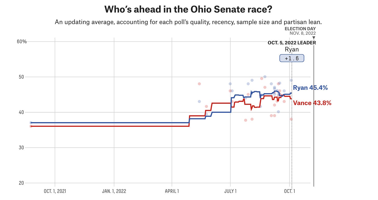
Take FiveThirtyEight’s polling average in Ohio as an example. It currently shows Democrat Tim Ryan leading Republican J.D. Vance by 1.6 percentage points:
Yet one big problem with this number is that almost the entirety of the really good polling for Ryan has come from a political action committee called Center Street PAC that has endorsed Ryan for Senate but is not marked as partisan by 538. If 538 had marked this firm’s polls as partisan, they would have been adjusted back toward Republicans and the aggregate would probably show a (more reasonable, IMO) number closer to a Vance lead—which is what the average of nonpartisan polls in the race shows.
This should remind us all that, due to researcher degrees of freedom even the precise value of the average of polls technically has uncertainty around it. And that is why I have argued in the past that 538 really needs to be showing margins of error on its charts of polling averages. (And that’s before we even cover the fact that all of these polls could be biased by uniform biases in the survey data-generating process.)
One remedy? Average the averages. If FiveThirtyEight, the New York Times and The Economist are all showing different numbers for a race, look at the decisions they make in their methodology statements and consider how those choices may impact their results. (But maybe skip RealClearPolitics.)
Talk to you all next week,
Elliott
Subscribe!
Feedback
That’s it for this week. Thanks very much for reading. If you have any feedback, you can reach me at this address (or just respond directly to this email if you’re reading it in your inbox). And if you’ve read this far please consider a paid subscription to support the blog.

