How to read the polls like a nerd | #205 - October 2, 2022
Four tips from me for getting smarter about the polls. Plus, a brief history of survey methodology and October Q&A announcement!
Happy Sunday everyone,
Philip Bump, who writes chart-forward articles about US politics for The Washington Post, recently asked me to send him three tips for how to read the polls like an expert — “or, at least, not like a newbie.” Here is what I told him:
Take the “margin of error” and double it. Remember that a poll is a sample of a larger population. Every pollster reports (or should report — if they don’t this is a red flag) a staitstic called the “margin of error” that tells you how wrong their poll could be based on the chance they talked to an unrepresentative sample of that larger group.
But research has shown that a single election poll is subject to much more error than just this “sampling error” alone. For example, there is the chance that members of one party are less likely to take their polls than another (which is what happened in 2020 and 2016), and there is error in predicting who is actually likely to turn out to vote. So historically, the distribution of errors in election polls is about twice as large as the margin of error implies. This leads me to the second point:
Aggregate polls together. Because individual polls are subject to so much error, averaging them together gives you a better idea of the shape of opinion on a given subject — whether that be who people are going to vote for or whether they favor a certain policy. This also helps you avoid overreacting to any phantom swings between polls that happen because of the high degree of noise in any one poll.
Finally, think about the process that created the poll(s) you’re looking at. Scrutinizing an individual pollster’s methods can help you determine if their numbers are more trustworthy. Suppose a pollster conducts a poll only of people who have a landline and does not adjust (or “weight”) their sample to be representative of cellphone owners, for example. In that case, they are going to overestimate support for the types of things people who have landlines favor.
But this also helps us remember that the average pollster is generally subject to the same types of bias as all the other pollsters are. If the “data-generating process” (as statisticians like to call it) for one poll is biased because Democrats or Republicans or elderly people etc. aren’t answering its interviewers, then other polls are also likely to be off. This helps you calibrate expectations for errors ahead of an election.Talk to you next issue,
All of this advice is taken, in some form or another, from my book. And readers of this blog (or the book) may be familiar with the overall theme here: do not treat polls as precise predictions of public opinion, but as estimates that are typically reliable but come with uncertainty. A single poll is the result of a process both scientific and artful. It comes with statistical forms of error from sampling as well as error from the many assumptions from researchers that inherently leak into the process along the way. Consider, in other words, the “data-generating process” for a poll.
This is working unpacking briefly. Then, I’ll offer one more tip that I didn’t have room to send Bump.
How polls work (briefly)
But first, let’s talk about uncertainty and the science of surveying. A brief overview of the methodological history of (American) public opinion polls might read something like this:
Before we had scientific public opinion polls, we had “straw” polls. The earliest evidence of such informal surveys comes from the 1824 elections. They were used prominently up until the mid-1900s. In 1936 the most famous straw poll, one conducted by the Literary Digest magazine, missed Franklin Roosevelt’s margin of victory in the national popular vote by 38 percentage points. That is the biggest national “polling” error ever.
The blunder was predicted by a new pollster named George Gallup — a former Madison Ave. ad man turned political prognosticator and surveyor. (In an interview in the 1980s Gallup recalled thinking in 1935: “if it works for toothpaste, why not politics?”) Gallup used a more scientific method of surveying called quota sampling, where people were selected for interviews based on their demographics: their sex, age, income, and region. This allowed him to develop a (roughly) representative sample with a much smaller slice of the electorate than the Digest “poll” needed (Note: For a while Gallup excluded African Americans in the South from his polls. The rationale was that because they were nearly universally barred from voting by racist Jim Crow Laws, sampling them in pre-election surveys would skew his results.) In the end, Gallup had Roosevelt winning by 12 points. (He ultimately won by 24.)
Thus, “scientific” polling took off. Soon everyone was doing it: Gallup, Elmo Roper, and Archibald Crossley (the former research director of the Literary Digest) established successful firms doing a variety of measurements of the attitudes of the average American.
Even scientific polls, however, were not perfect. Come 1948 it was discovered that the polls from George Gallup and his peers were still susceptible to underestimating support for parties within the demographic quotas upon which they built their samples. The solution, according to the Social Science Research Council, a group of pollsters and academics, was to sample Americans randomly by household — a technique they borrowed from the Census Bureau. Gallup took this one step further, sampling respondents in redder and bluer areas of the country proportionally. His polls did bitter—until they didn’t. In 1980 an average of polls would still have missed Ronald Reagan’s vote margin by 8 percentage points.
The story of polls thereon is a story of two tracks of methodological and technological improvement.
On one track, pollsters make adjustments to their samples and methods so that their accuracy at election-snapshotting increases. These developments include things like better likely voter screens, sampling respondents off lists of registered voters that are compiled by state governments, and the development of sampling algorithms that can better provide balanced samples of respondents by political part.
At the same time, pollsters are also reacting to societal and technological changes that make conducting a high-quality poll harder. Response rates decrease sharply from the invention of random-digit dialing in the 1970s to the early 2000s, causing some political pollsters to turn to find respondents via the Internet — and, more recently, SMS text. All the while pollsters are also developing new methodological tools to make these new modes work. Statistical terms like “raking,” “inverse propensity scores,” and “multilevel regression with poststratification” become commonplace in the survey statistician’s lexicon over the period.
The upshot from all of this is that conducting a political poll today is much more difficult than it was a half-century ago.
Despite advances in computation and methodology, getting a sample of Americans that is balanced demographically and politically is harder than ever. That is because the data-generating process for any given poll has become dramatically more complex. Low response rates, for example, mean some pollsters even dynamically adjust who they are sampling to achieve representativeness, boosting calls to voters they have had trouble reaching and stopping calls to types of people they have already heard from (say, white college graduates under the age of 30 who live in cities in the northeast). Then, those surveys are weighted to a variety of demographic targets. Then, in elections, they are further massaged to be representative (or so pollsters claim) of likely voters. And on, and on, and on.
And this means individual polls are subject both (1) to a high degree of pollster-induced error—via things like (a) not weighting to the right demographic or political targets, (b) restricting sample coverage by choice of mode and conducting interviews among an inherently unrepresentative group—and (2) industry-wide bias, via skewed response rates among certain groups of the population that cannot be accounted for with traditional weighting methods (eg, people in the 90th percentile of supporting Republican candidates for office).
For evidence of the first type of error look no further than the ABC/Washington Post surveys in Wisconsin in 2020. They ran the gamut from Biden +4 to Biden +17, depending on the field date of the survey and whether you pick the registered voter or likely voter versions of the survey. Or take CNN’s polling with SSRS, which seemed to zig-zag every week, oscillating between Biden +4 and Biden +16 over the course of the campaign. Then, consider that the average bias in the national polls in 2020 was higher than in any year since 1980 — and state polls were the most biased on record.
When we are faced with both error and bias in polls, our ability to reliably capture public opinion with a single survey is severely diminished.
None of this is to say, by the way, that polling is broken or that you shouldn’t trust surveys. But you should be cautious, as I said to Bump, reading polls that don’t look to be produced via very sophisticated (and transparent!) methodologies. And you should also think about all the opportunities for bias to come into the data-generating process affecting all polls.
If you do this, my hope is that you will treat polls with much less certainty than the media has in the past. As Emily Guskin, a polling analyst at The Washington Post, told Philip Bump:
At best, polls can provide roughly accurate estimates of candidate support, but they are not capable of saying which candidate leads in close races
And as Ariel Edwards-Levy, who writes about polls for CNN, said:
Polls are not precision instruments, and expecting them to give you exact answers will make them a lot less useful to you than treating them as one tool for gauging broad public sentiment.
If you look at polls holistically, using them to hold in your head the shape of a general distribution of possible opinions the public holds, you will be much better off. You will be less prone to reporting on errors in individual surveys or bias in the aggregates, and saner after polls inevitably misfire again. Plus, it’s technically the right way to look at polls, anyway.
One more tip for reading the polls
Now that I have told you that polls are more uncertain now than in the past and maybe even more prone to uniform bias, let’s talk about how to deal with that uncertainty when reading polls—specifically, averages of polls.
The tip I would have sent Bump is: Imagine the election outcome in which the polls are as biased as the worst-case scenario historically.
Election forecasts typically give you a range of possible outcomes of the election conditional on a range of polling errors — say, for example (and I’m making up numbers here) every implied outcome from every value of bias running from polls underestimating Democrats by 6 points or overestimating them by 6 (so, -6, -5.5, -5 …. +5, +6, etc). Election forecasters then use statistics (1) to gauge the empirical likelihood of each value of bias, based on the historical record of polls and (2) to simulate thousands of different elections in which each simulation gets assigned some value of bias in proportion to its predicted likelihood.
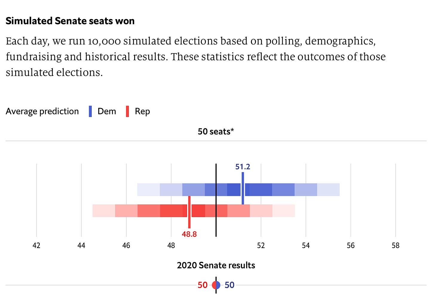
The resulting distribution of errors is used to visually convey to readers the range of outcomes of the election according to the polls and their empirical, historical reliability. These distributions show you what will happen if polls are right on average, or if they are as biased as they have been historically. Take this chart of The Economist’s 2022 Senate forecast, for instance:
Or this one from FiveThirtyEight:
These charts are great at giving readers a sense of the probabilities of various outcomes being generated by the election modeler. But one disadvantage they share is that they force people to focus on the middle of the distribution and at most likely predicted outcomes. Obviously, this is desirable if you want readers to calibrate expectations probabilistically — which we do want! — but it may leave them unprepared for elections in which polling bias or error falls outside of the 80%-95 confidence interval (see: 2016 and 2020).
To deal with that problem, we can turn to something called conditional forecasting. Here, we look at what polls and election forecasts would say if the polls nationally or in each state were biased by a certain amount. Eg, what happens to our expectations for the Senate if we also show readers this table?
What looked before like a lot of blue now looks like a really close race for the Senate, with Democrats on the cusp of losing 1 net Senate seat instead of gaining 1-2 on average — and down from gaining four if you take the polls in each state 100% literally and assume no error. That has the advantage of helping people prepare for what the election would look like if the polls are wrong, setting aside the probability of that happening.
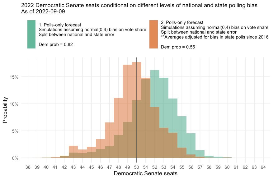
You might additionally recreate the histograms for different scenarios of average polling bias, as I have done here:
I think using charts like these in conjunction with our traditional histograms provides readers with a better understanding of the range of election outcomes that are being “predicted” by the polls on any given day.
And that is tip 4: How conditional forecasting makes us smarter readers of the polls.
Talk to you next week,
Elliott
Monthly mailbag/Q&A!
The next blog Q&A will go out on Tuesday! Go to this form to send in a question or comment. You can read past editions here.
Subscribe!
Feedback
That’s it for this week. Thanks very much for reading. If you have any feedback, you can reach me at this address (or just respond directly to this email if you’re reading it in your inbox). And if you’ve read this far please consider a paid subscription to support the blog.


