


Has the Midwest drifted back toward the Democrats?
A quick look at the polls suggests... maybe?

Friends,
I enjoy hearing from you. As a bonus, I get a lot of good ideas for blog posts from your emails. In fact, this very post was inspired by one of said emails. So don’t be afraid to send me your thoughts. They are very welcome.
Elliott
A reader named Matt emails:
This came up in a discussion with a friend and I didn't have a good explanation for it, and I'm thinking maybe it would be interesting for newsletter subscribers like myself.
The 2018 national congressional 2 party difference was around 8.6 points. The estimated 2020 2 party Presidential vote share in the economist model is 8.4 points. The 538 average of current (not projected) generic congressional vote share is about 8 points. All pretty similar.
However, in 2018, several statewide races in key swing states like WI (Gov) and FL (Gov + Senate) were real nail biters. But in 2020 with similar national estimates, the Economist model's estimate for WI and FL is more comfortable ~6 & 4 points respectively.
What's shifted under the hood that gives such similar national numbers in 2020 to 2018, but pretty different projected statewide margins for 2020 in WI and FL?
He quickly sent this follow-up:
Derp. Just noticed that statewide House margins in WI and FL in 2018 were pretty close to 6 & 4 percent. So maybe there isn't anything interesting to explain after all.
Matt is right! Wisconsin and Florida leaned about 3 and 5 points to the left in US House races in 2016 and 2018, with only a little variance around that depending on how you calculate the margins (I’m using a dataset that controls for the lack of votes for certain candidates in uncontested races). His email shows the importance of comparing results from year-to-year while holding the office constant; while the relative leans of House races didn’t move much between 2016 and 2018, results in governors races did. But perhaps because of the various candidate-specific effects in the contests for governors’ mansions, the former comparison is more telling.
I can bring some more information to the table. Recall that I have a very simple toy election model running that aggregates polls and predicts how each state will vote based on various demographic attributes, such as the share of voters who are evangelical or how Hillary Clinton performed in the state in 2016.
When I take that model’s predicted state-level vote margins for Joe Biden and subtract Clinton’s actual vote share there in 2016, I get a map that looks roughly like this, where blue states are ones that have drifted to the left relative to the national environment and red states are ones that have drifted a bit to the right:
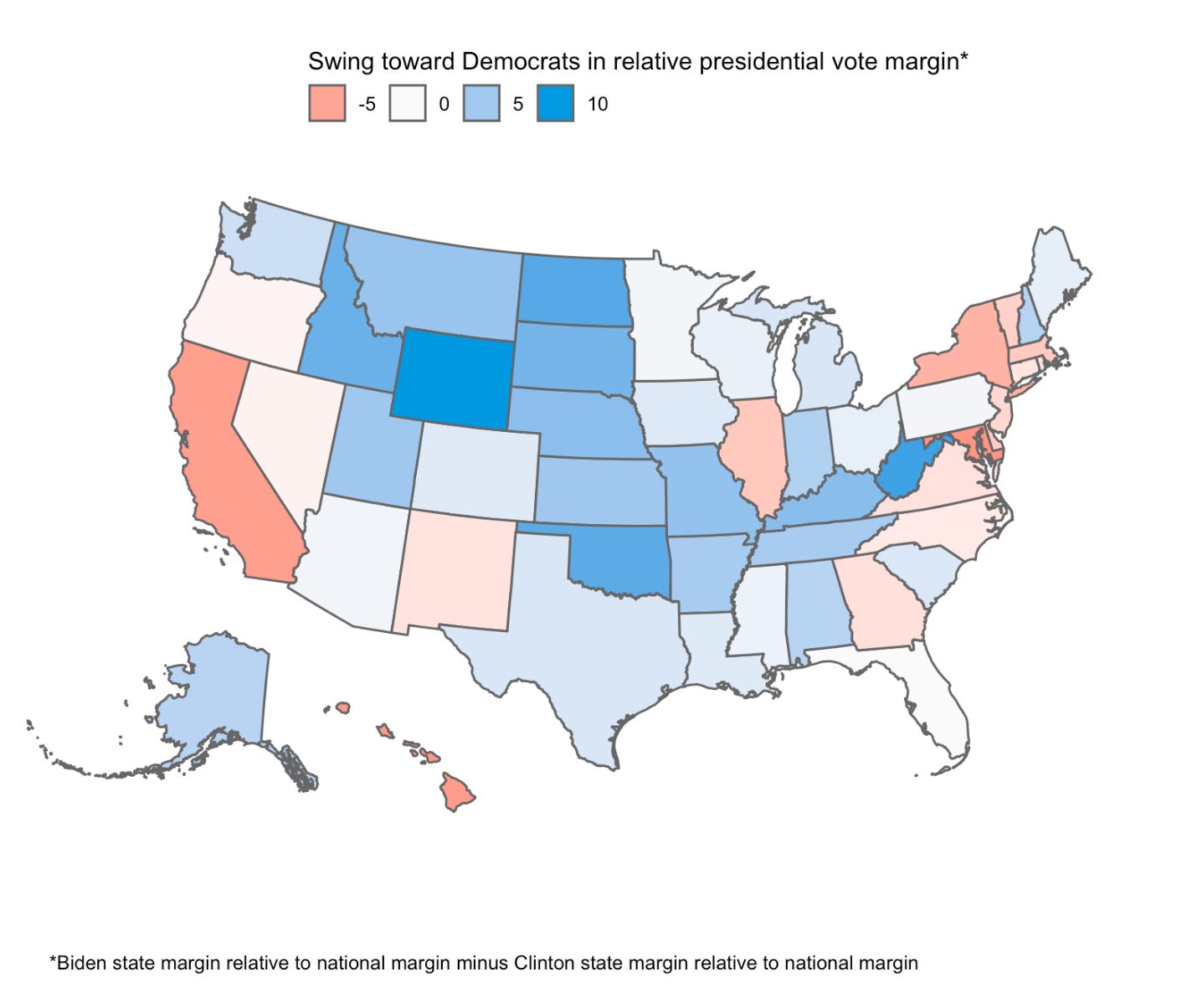
There is a lot to unpack here but let me just offer three big notes.
The first is that there is some mean-reversion going on, either in fact or an artifact of the model (we don’t have a lot of polls in Republican or Democratic strongholds so our model has to make rough approximations with the regression model). On average, we predict that red states have gotten bluer (Wyoming, Oklahoma and West Virginia stand out) while blue states look redder (eg for California, New York and Illinois). That said, mean-reversion is typical across presidential contests, so maybe these “weird” patterns are actually exactly what we should expect!
Second, it looks like the Midwest has gotten a bit bluer over the past four years. After controlling for Joe Biden’s improved margin nationally relative to Hillary Clinton’s, it looks like Michigan, Wisconsin, Iowa, Ohio, and Minnesota have all shifted between 1 and 4 points to the left since 2016. That matters a lot when we’re modeling election results because it means the margin by which Joe Biden needs to win the national popular in order to win the electoral college has also shrunk. The election is less rigged against them.
Third, it’s interesting that Texas and Arizona have drifted to the left while Georgia apparently has not. That’s interesting and cuts against a lot of the other theories about Peach-state voters getting more democratic over the last couple of years. Maybe they have, but evidently not more than the average American has anyway.
It’s important for me to note the volatile nature of these relative partisan leans. When I engaged in a similar exercise earlier this year, polls in Midwestern states indicated their voters may have drifted a bit more to Republicans since 2016. That’s obviously not the case now, and prompts the question of whether we’ll see different numbers by November. So don’t take this as the last word.
My “toy” model updates every day (actually, multiple times each day), and auto-generates a new version of the map above each time. So if you want to stay on top of the data, just open the webpage and put it in your bookmarks bar! ;)
Great work as always!
It appears that Pennsylvania hasn't moved towards the Democrats unlike the rest of the Midwest/Rust Belt states. What is the difference between Pennsylvania and the rest of the Midwest including Wisconsin (the 2016 tipping point state) and Michigan? PA is currently the tipping point state in The Economist's model, so this seems important to understand.
Nice analysis. Have you compared your model with the Economist model? It would be interesting to know how much overlap. It could also reduce the uncertainty in both models.