Why this election map is so good
It manages a good balance between how turnout and vote share changed since 2016
Allow me to direct you to this piece at NPR: “How Biden Won: Ramping Up The Base And Expanding Margins In The Suburbs.”
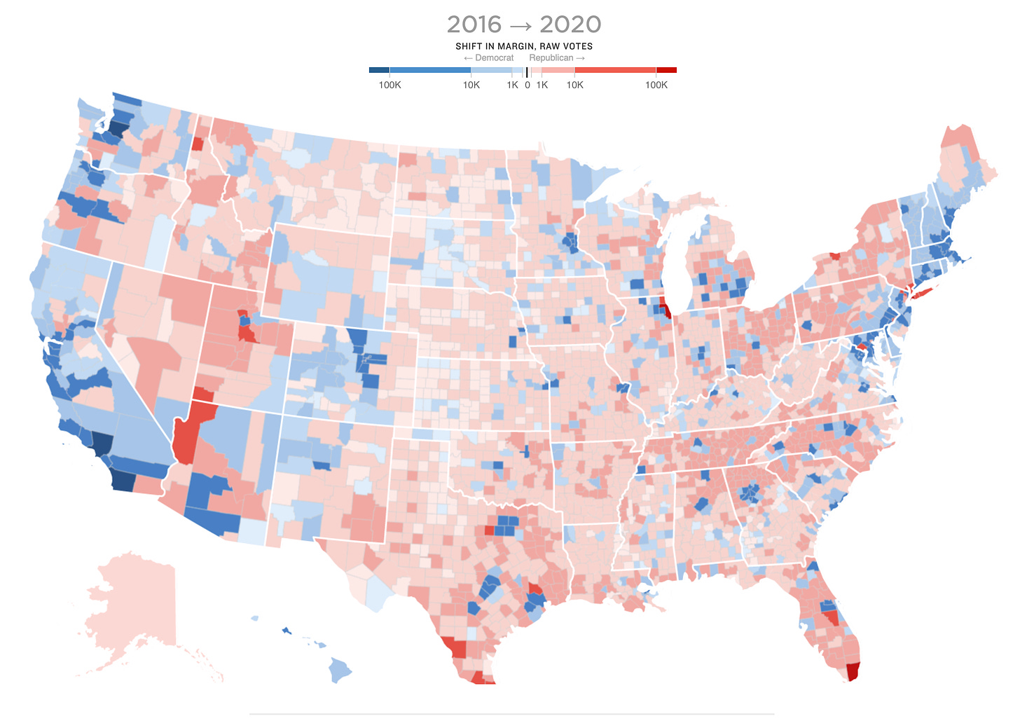
It is a fine piece with good reporting and number crunching, but my favorite part is this map:
The colors show the change in the raw vote margin for Joe Biden and Hillary Clinton between 2016 and 2020, where bluer counties show that Democrats gained more raw votes (think a change from 100,000 to 120,000 actual ballots) and redder counties represent gains in raw votes for Donald Trump.
This is a very intuitive way to iterate on the typical swing map, which shows the change in each county’s Democratic/Republican vote share from one election to the next, but does not convey any information about turnout. But in 2020, we also care about how increasing turnout nationwide factors into the puzzle. For example, lots of counties moved slightly to the left on vote sharer, which the standard swing map would shade blue. But since turnout increased in those counties its net contribution to Trump’s vote margin actually increased, giving it a shade of red here. I think that’s an important story to the election and this map conveys it pretty well.
My only complaint is the color scale. It seems like the difference between 100k and 1k extra votes for a candidate warrants more than just 4 colors on each side. Maybe the mapmaker could add some sort of transparency to convey the disproportionate number of votes in America’s urban and suburban counties.


