Why most polls on a no-fly zone over Ukraine are a no-go (so far) | No. 187 – March 13, 2022
Polls are the result of a complex data-generating process that can be influenced by randomness, unpredictable biases, and, yes flaws in human judgment
One of the reasons empirical journalism is useful when studying people and society is that data offer us an objective barometer with which to measure some phenomenon or — to use the social science jargon — “quantity of interest.”
At least, that’s what data are supposed to do. But it is worth constantly reminding yourself that not all data are created equal. It is the reality of science — an iterative process of experimenting and refining — that we often have to peer into the process that created the numbers we are looking at to know if they are truly 100% reliable.
I have recently found myself reminding people to consider this so-called “data generating process” in public opinion polling, as I increasingly see pundits and journalists citing polls that (claim to) show American support for enacting a no-fly zone over Ukraine. Such a zone would, presumably, give NATO aircraft the authority to shoot down Russian jets flying in Ukrainian airspace. That would almost certainly escalate America’s role in the conflict. It could even lead to direct US conflict with Russia’s military.
A conflict between two nuclear disasters should obviously be avoided at all costs. That is what makes “high” public support for a no-fly zone over Ukraine so shocking.
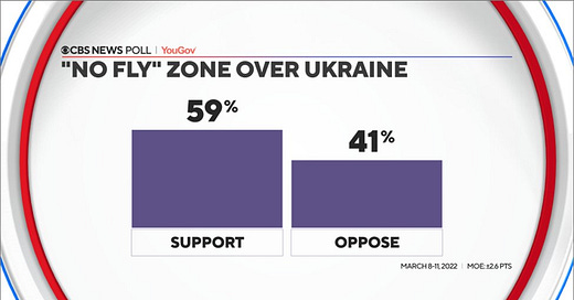
A CBS News/YouGov poll released today showed that 59% of Americans would support such a zone while 41% are opposed:
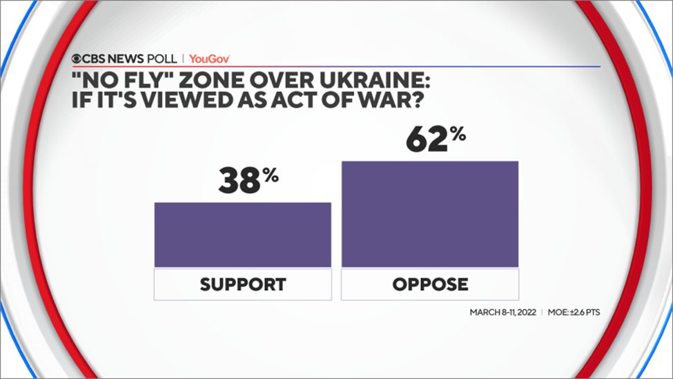
But that is if you simply ask people if they would support it and don’t explain the consequences. When CBS and YouGov asked respondents if they would support a no-fly zone over Ukraine “if it’s viewed as an act of war,” support dropped to 38%:
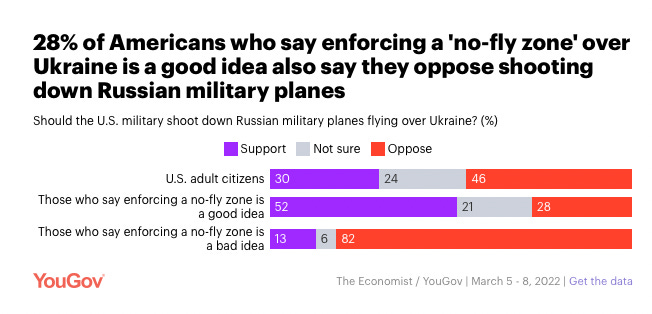
And other polling from YouGov showed that only a bare majority of Americans who support a no-fly zone over Ukraine would support shooting down Russian planes:
. . .
In isolation, this is a good example of how the particular way a researcher words a question can dramatically impact their results. This case also reminds us that polling on topics that require a lot of hard information is not useful unless people are made aware of those facts. (And that brings up a host of other questions, such as how you give respondents the requisite information in a neutral way.)
But the question-wording issue on polls of no-fly zones also fits into our broader conversation about how various steps in the data-generating process can end up biasing political polls. Remember that the 2016 and especially 2020 elections highlighted how higher rates of nonresponse among Republicans could lead pollsters to underestimate support for Republican candidates for office. Both of these errors — one, from measurement error, the latter from nonresponse — can occur in any single poll. And uniform biases across pollsters can also impact polling aggregates and broader narratives about politics and society, global conflict, and, by extension, even our perceptions of reality.
That is why readers of polls must think through how the data-generating process could bias the numbers they are presented with. At a bare minimum, they should look at the wording of individual questions and consider the impacts on opinions of potential alternatives. Readers more familiar with polls should also look at demographic crosstabs and look for wild deviations from other data. If a poll shows 40% of Black voters supporting a Republican presidential candidate, for example, something might be off with the various processes that are coming together to create the final product.
This is not to say that polls are useless. They are the products of a very complex series of decisions being made by people who are usually right but often wrong. You should not discard them altogether. But you should be careful with them. It is precisely because they are so influential that they are worth being so careful with.
Posts for subscribers
If you liked this post, please share it — and consider a paid subscription to read additional posts on politics, public opinion, and democracy.
I wrote one bonus post for all subscribers this week:
What I’m reading
I am finally getting around to finishing Jordan Ellenberg’s Shape: The Hidden Geometry of Information, Biology, Strategy, Democracy, and Everything Else (geez what a subtitle huh?). It is an excellent book and I highly recommend it. Some of you will recognize some of my phrases in Ellenberg’s writing about polls, such as “the soup principle.” (Actually, that’s the only phrase.)
Also:
Addison Del Mastro on the housing crisis in suburban DC (and abroad) for his newsletter
Judith Lewis Mernit on driving better
My colleagues on how the war in Ukraine is making Russians less happy at home
What I wrote last week
Here is one piece from me for The Economist on the history of approval-ratings bounces from crises in foreign affairs. (Many of you will recognize this as the so-called “rally-around-the-flag” effect.)
I also wrote about how Americans are becoming happier with Joe Biden’s leadership as the war in Ukraine goes on.
That’s it for this week. Thanks very much for reading. If you have any feedback, you can reach me at this address (or just respond directly to this email if you’re reading in your inbox). And if you’ve read this far please consider a paid subscription to support the blog.


Hi Elliott,
I agree that polls can have very different results depending on the wording of the poll. It's important for the polls to have clear and precise wording. How are we supposed to have a sense of what policies the American people support, so their views can be represented in government?
-Elliot