


Should you trust polls with big margins of error? 📊 June 21, 2020
Uncertain indicators can be informative when aggregated together

Welcome! I’m G. Elliott Morris, a data journalist and political analyst who mostly covers polls, elections, and political science. Happy Sunday! This is my weekly email where I write about news and politics using data and share links to what I’ve been reading and writing.
Thoughts? Drop me a line (or just respond to this email). If you like what you’re reading, tap the ❤️ below the title; it helps the post rank higher in Substack’s curation algorithm. If you want more content, I publish subscriber-only posts 1-2x a week.
Dear reader,
There is a lot bouncing around in my head right now. I’m planning to write over the coming weeks about why polls-based horse-race political coverage might be bad (a counterargument to a piece I wrote last month), how political betting markets are getting the election wrong and maybe about coronavirus again. I also have a big project on how to read the polls that I need to finish for you folks. But I need to think those ideas through a bit more, so today I’m going to write a wonky piece about polling data. How good are the polls? Why should you trust data that have big margins of error? How much weight should you put on them?
Should you trust polls with big margins of error?
Uncertain indicators can be informative when aggregated together
I want to spend this week’s email talking about the theoretical foundation of Bayesian inference: belief updating. (If you’re eyes are already glazing over, just stay with me, this will pay off I promise.)
Bayesian inference is the idea that we all start with some knowledge about the world and build upon that understanding with new information. And when we encounter new information, we implicitly weight it against the information we have so far. We make judgements about (a) what we know and (b) how certain we are of it.
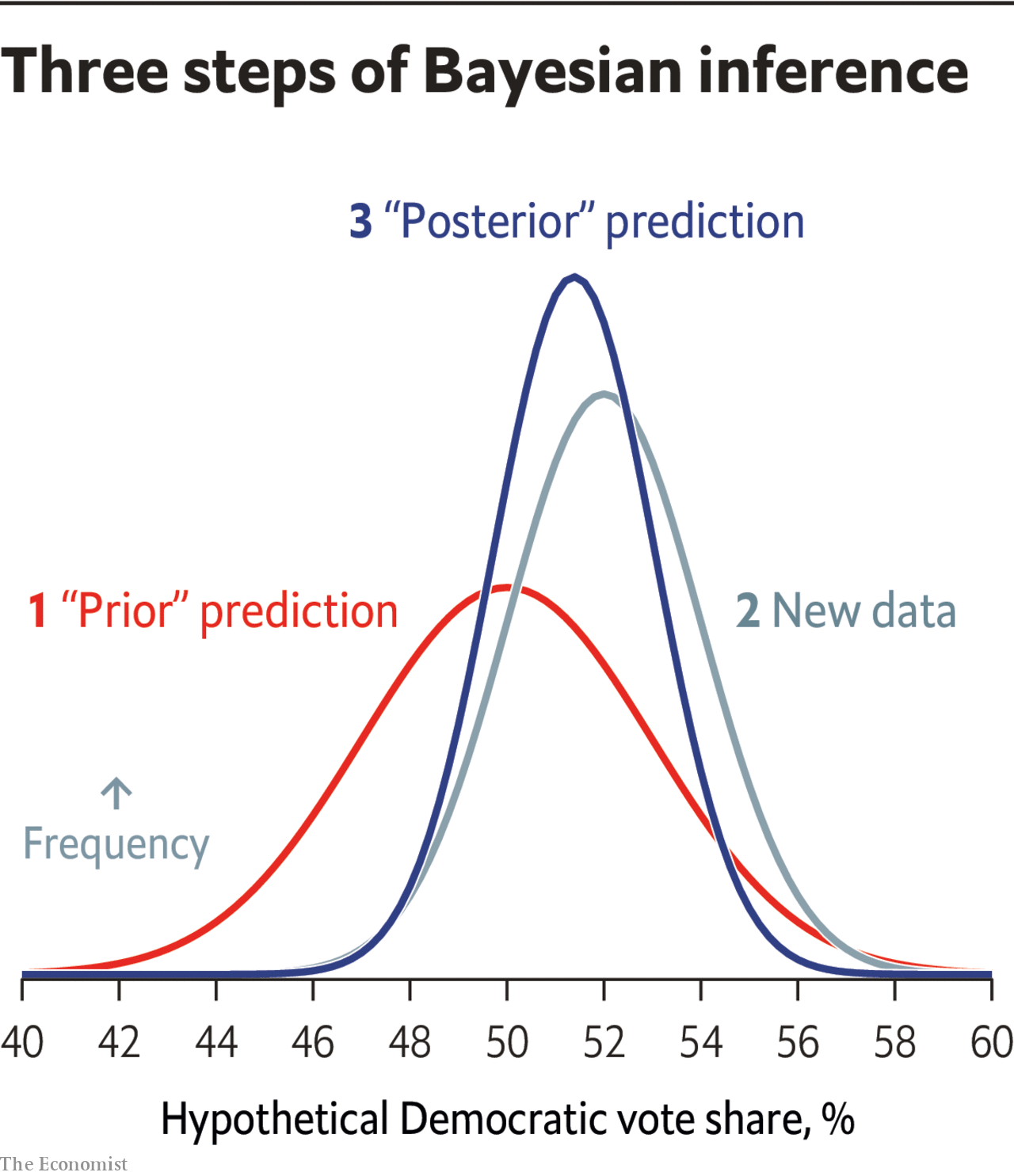
This will sound pretty basic to anyone who has spent some time with Bayesian statistics so forgive me for dwelling on this, but I expect it will also be eye-opening for some of you to know that we can represent this process mathematically. The Economist recently published a pretty aesthetically-pleasing chart representing the workflow of Bayesian inference:
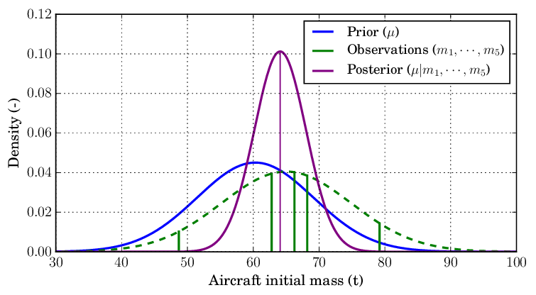
(Side note: it’s amazing how much good graphics can help us understanding things. The following chart is showing the exact same thing, but all the noise and lack of labels makes it much less intuitive.)
To use the same terms as them, we…
Start out with a “prior” prediction for what we know about the world
Add new data on top of that prior
Arrive at a “posterior” understanding of x, y, or z phenomena
Much of the time, the math for this updating is pretty straightforward. I’ll use polls as my example.
The vast majorities of pollsters are doing math in a world where distributions follow the typical bell-shaped curve (or “standard normal” distribution) that many of us are taught in high school statistics. For example, they calculate their margins of error assuming that the “true” percentage estimate they are approximating with a poll falls within 1.96 standard-deviations of whatever estimate they came up with, and that standard-deviation is itself a function of how many people the poll samples (and the percentage estimate in question). If a candidate is polling at 50% in a 1,000-person poll, for example, the margin of error is calculated as the square root of 0.5 times 0.5 / 1,000, all times 1.96, or 3 percentage points (type this into Google: “sqrt((0.5*0.5)/1000) * 1.96”).
This fits nicely into the Bayesian workflow if your prior is also “normally distributed”—AKA follows a normal distribution. If your prior is that a candidate would win 52% of the vote, and you were 95% sure it wouldn’t be higher than 60 or lower than 46 percent, then you’d also have a standard-deviation of about 4% (8/1.96). Combining your two distributions is pretty straightforward from here, though I won’t bore you with the exact equations* you need to calculate the posterior (the process is represented in the above picture—math in the footnotes).
If your prior is that the candidate would win 52% of the vote with a standard deviation (SD) of 4
And your data (the fake poll above) is 50% with SD = 3
Then your posterior will be a weighted average of the two, with the weights decided by the “statistical power” from the distribution—a datum with a smaller margin of error will get more weight. The resulting distribution has a mean of 50.7% and a standard deviation of About 2.4 percentage points (a number skewing toward the more certain indicator we have).
Doesn’t that make a metric ton of sense?? This is exactly the type of workflow that election handicappers are doing all the time! We are constantly reconciling various sources of information to arrive at a new prediction. The improvement here is that I’ve just written down the mathematical process for what we’re doing implicitly.
And once we have looked inward at the math we are doing implicitly, we can also make sense of just how useful “uncertain” data can be.
Imagine you also get a new poll that has a margin of error of 10 percentage points. How much is it worth? Someone on my Twitter feed this week thought that such an indicator would be worthless:


But as a Bayesian who knows that data can be helpful to update your beliefs regardless of how certain you are about them (well, to an extent—new data with a margin of error of 100 percentage points would not be weighted practically at all against our revised posterior distribution with a SD of 2.4 from above), you might not be so quick to shrug off a new poll with a big margin of error.
Following the same formulas from above to add onto our 50.7% /SD = 2.4 distribution a new prediction of 55% for the imaginary candidate with a margin of error of 10 percentage points, you would get a slightly higher mean of 50.9% and a slightly smaller standard deviation of 2.33%.
“Useless?” Far from it!
Now, there is an added complication with the polls that we haven’t taken into consideration here. The real amount of error in our distributions is higher because the chance that all the polls are biased in the same direction is higher than 0. If you were to actually go and simulate election outcomes or to build a forecasting model, you would want to take that into account. For our scenario, you’d be adding onto the posterior distribution a standard deviation of about 2-3%.
But for our purposes we don’t need to address the general bias of polling data—only to illustrate that uncertain indicators can, in fact, be helpful. That’s the magic of aggregation. And in the Bayesian context we also preserve the uncertainty of our resulting posterior distribution, which is helpful.
Footnotes:
*1 if you really want the equations from above…
mean = ( 52 * ( (1/(4^2)) / ((1/(4^2)) + (1/(3^2))) ) ) + ( 50 * ( (1/(3^2)) / ((1/(4^2)) + (1/(3^2))) ) )
standard deviation = sqrt( ( (1/(0.03^2)) + (1/(0.04^2)) ) ^ -1)
Posts for subscribers
June 18: A list of the things that could break election models. Voter suppression, a check-shaped recovery and a giant meteor are all things I’m worried about (to varying degrees...)
What I'm Reading and Working On
My thanks to all of you who sent recommendations for reading while I was on vacation. I took some of them. Please send more. I find that crowd-sourcing my next book generally leads to higher quality books. And to return the favor let me say that I am really enjoying revisiting Michael Lewsis’s The Undoing Project, which you should really read if you haven’t already.
Thanks for reading!
Thanks for reading. I’ll be back in your inbox next Sunday. In the meantime, follow me online or reach out via email if you’d like to engage. I’d love to hear from you!
If you want more content, I publish subscriber-only posts on Substack 1-3 times each week. Sign up today for $5/month (or $50/year) by clicking on the following button. Even if you don't want the extra posts, the funds go toward supporting the time spent writing this free, weekly letter. Your support makes this all possible!