New US Congressional maps are the fairest in a decade — but not quite as fair as people want you to believe
Analysts are also systematically ignoring the diminished responsiveness of the legislative chamber
The New York Times has a very nice piece on redistricting out today arguing the 2022 US house map will not be significantly biased toward Republicans. This is thanks to Democrats benefiting from litigation against gerrymandered maps in states like Ohio and North Carolina, as well as their own gerrymandering in places like New York and New Mexico.
While I don’t disagree with the overall takeaway from the piece (that maps will be fairer in 2022 than they have been in a very long time), a proper account of the data reveals significant uncertainty over precisely how fair it will be. I also argue that analysts have been systematically ignoring “responsiveness” as a key criteria for overall fairness. Read on for my explanation.
Before I go on, note that I have made many of these points in scattered pieces for The Economist over the last month (though with data that was missing Congressional maps that have since passed). You should read our big analysis of redistricting in early February here, an analysis of map responsiveness here, and a podcast where we discuss those things and more here. But those pieces don’t go into the details of the calculations we performed and how they differ from the Times’s. I am going to do that here, and sprinkle in some references to the political science literature that suggest the right way to go about this.
I. What is “fair,” anyway?
The first point I want to make is that how we quantify biases to determine what is"fair" really matters. Different methods produce different results.
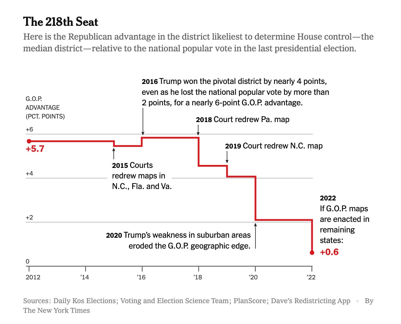
The Times does this by counting the number of US House seats that (would have) leaned toward Biden in 2020. They say there are 217 of them, which is a big increase versus 2020 and really about as "fair" as maps get. Another way to measure this is to sort every House seat by the Democratic candidate’s margin in the previous election, take that number from the 218th House seat, and subtract the Democrat’s margin in the national popular vote. Over time, you get a graph like this:
That looks pretty fair! Definitely fairer than the map in 2012.
However, other metrics do not show quite as much fairness. For example, if you adjust for the tendency for House Democrats to underperform Biden in closer seats, the number of Democratic-leaning seats drop to 214. Then, if you use the 2016 partisan lean to calculate the bias of each seat (which is what we do in predictive models because it is more predictive of lean in the next election) you get 209. Again, that’s fairer than the 2020, 2018, or etc maps, but not quite fair. That number suggests Republicans would control the US house by about 8 extra seats if the House popular vote was exactly tied.
The point here is not that the Times’s measure is wrong per se, but that how fair you think the map is depends on how you analyze election results. It is interesting to me that analysts are picking the strategy that produces the fairest chamber and ignoring all other measures.
II. What’s “fair” is not actually fair
The second big point is about the difference between national and state-level fairness.
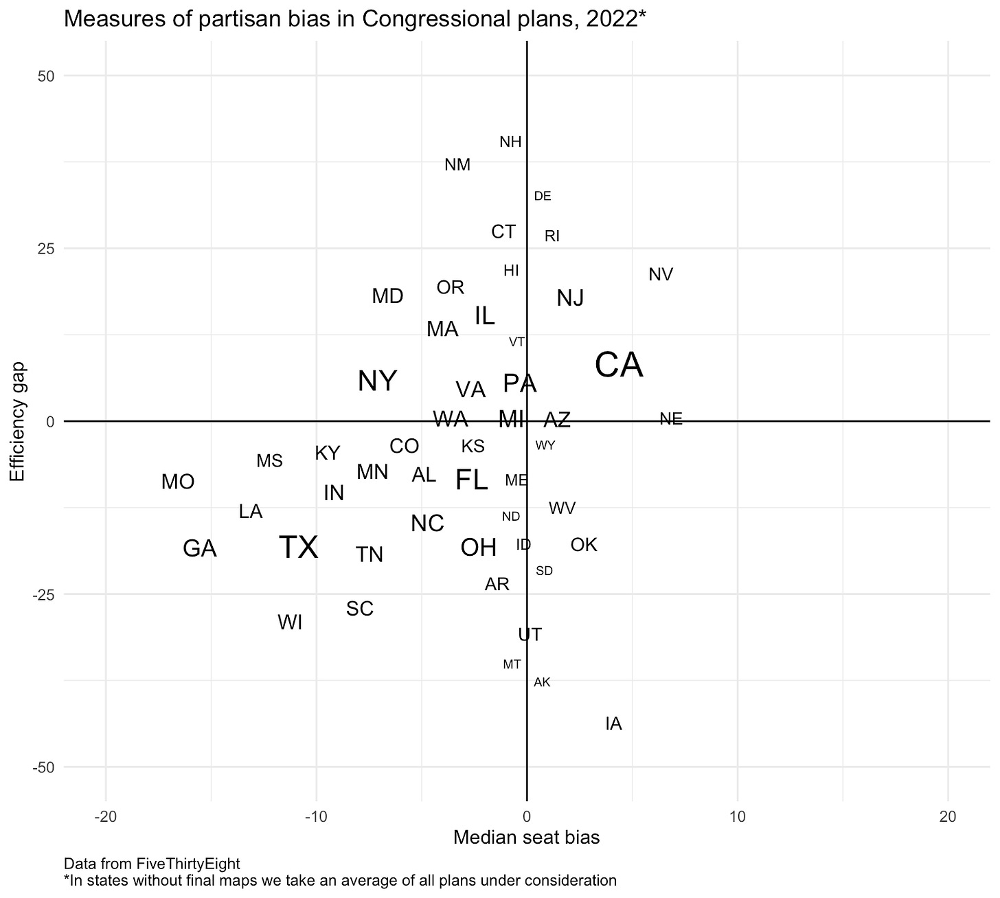
While people are focusing on the rosy national number for Democrats, another measure called the "efficiency gap" reveals much sharper biases at the state level. It shows that states Donald Trump won in 2020 have engaged in much harsher gerrymandering than in Biden-won states.
The efficiency gap measures the difference in the number of "wasted" Democratic and Republican votes in a state. "Wasted" votes are those in excess of the winning number in seats the party wins and all the votes in seats they lose. This means the efficiency gap essentially captures how much each party’s supporters are "packed" and "cracked" between and across seats.
When we look at the average efficiency gap nationally, it's about 3% tilted to Republicans. That means about 3% more Democratic votes are "wasted" across America than Republican votes. That comes out to about 3 million more wasted Democratic voters than Republican voters. Now, that’s a lot of people — it’s about equal to Hillary Clinton’s electoral margin in 2020 — but that's actually pretty good. The original paper introducing the efficiency gap, by Nicholas Stephanopoulos
and Eric McGhee, says maps are demonstrably biased if their efficiency gap is greater than 7%. So not great, not horrible, I guess.
But when we look at America's states, there are extreme differences in the degree of gerrymandering by party. States Biden won have an average efficiency gap of about 6 points, up 4 points from 2020. That reflects the new gerrymandering in those states and it means about 6% more Republicans than Democrats are "wasted" there.
Republican-led states, on the other hand, have an efficiency gap of 15 points on average!
Another measure called the median-seat bias captures how far to the left or right the median Congressional seat is relative to the state as a whole. Republican states have much higher biases on average than Democratic states.
This shows how the "fair" House map nationally has been achieved by the dramatically unfair maps sub-nationally, particularly in Republican states, canceling each other out as they aggregate in Congress. National fairness, in this case, has been produced via horrendous state-level rigging.
And this leads me to the third and final point.
III. A fair map needs to be responsive to the people
My big disagreement with the conventional wisdom on the 2022 Congressional maps is that people are focusing entirely too much on *fairness,* AKA the partisan lean of the 218th seat, and ignoring *responsiveness* basically altogether. Let me explain.
While a fair map in a completely tied election is one quality of fairness in redistricting, we should see it as only one quality among several. The other key quality of a fair legislative chamber is that the number of seats elected for each party is responsiveness to changes in their share of the vote.
The question we’re asking here is: Do Democrats gain as many seats when Democrats gain votes as Republicans do when they gain votes?
The answer is no.
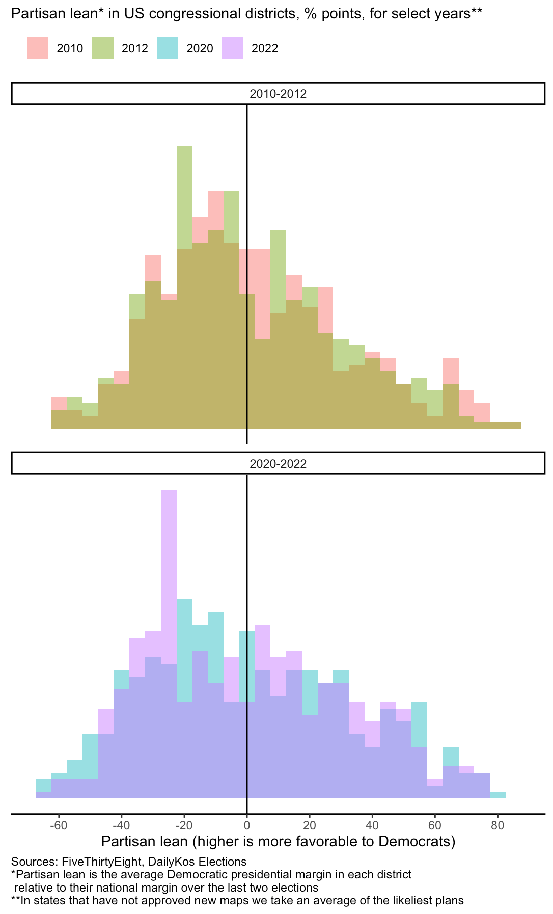
Look at these plots of the partisan lean of House district across years. Notice especially the huge spike in the number of safe Republican seats in 2022 relative to 2020. That's because Republicans have gerrymandered their maps to decrease competition — whereas Democrats have created a few more close Democratic seats to try to avoid a repeat of 2012, when they won the popular vote bust lost the House majority, as shown below. (NB: I talk about this more in a subscribers-only newsletter for The Economist here. That’s where the following graph comes from.)
The Democrats' creation of a few very competitive Democratic seats is what makes the national tally look "fair" in 50-50 elections. But what's going on under the hood is a much more tilted map *in all the elections where Democrats win with more than 50% of the popular vote.*
(And by the way, that above chart was from about a month ago. The updated numbers are even worse:)
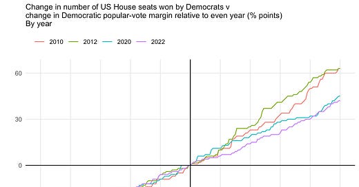
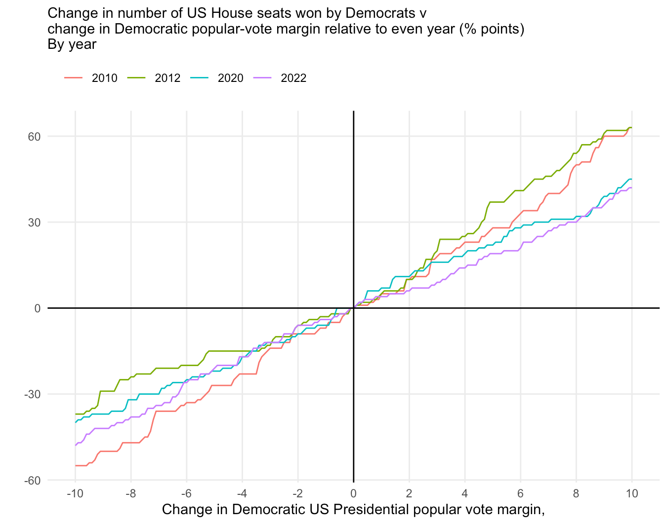
To see responsiveness in action, take a look at this plot of what happens to the number of Democratic House seats if we increase their vote margin by 0-10 percentage points:
By decreasing the number of close seats on their side of the aisle, Republicans they have shrunk the potential size of Democratic majorities relative to 2020. And Republicans, in contrast to Ds, have preserved about the same amount of responsiveness in scenarios where they win more voters.
Despite the media narrative about the overall "fairness" of the likely 2022 Congressional maps, this does not strike me as a particularly fair chamber.
So, to summarize:
1) Most analysts appear to be picking the best-case metric for Democrats when writing about "fairness." But this is not the only metric—and perhaps not even the most accurate one. While the 2022 Congressional maps are fairer than previous year’s maps, they are not quite as fair as people want you to think.
2) National fairness is being produced by very unfair state maps “canceling” each other out when they are aggregated together. This is especially true on the right; Republican gerrymandering is both more common and more intense than Democratic gerrymandering
3) The decline in competition from Republican gerrymanders has made the aggregate legislative chamber less responsive to changing national vote patters, a huge win for Republicans looking to prevent another 2018 Democratic “wave” election.
If you want even more details, please check out those links to Economist stories. I also urge you to read the other work on gerrymandering from Mr Stephanopolous and his colleagues: Link 1, Link 2.
. . .
The fair and responsive representation of people in government is crucial to the proper functioning of a democracy. As such, I believe it is worth being as precise as possible about what we measure, and how we measure it, when we are analyzing the performance of electoral institutions.
In this case, I think the additional precision reveals that the real story is not as rosy as the one the conventional wisdom has coalesced around. There is still a lot of work to be done to make American elections fair, in general, and House elections responsive, in particular. Here are a few ways we might get there.




Speaking as someone who has long worked in elections, you are seeing quantitatively what I'm seeing. Maps like this in state legislatures are usually incumbent protecting maps. The Congressional ones seem similar that way. That's a value very important to the people who get to vote on the maps.
Fascinating analysis. Thank you, Elliott.