


More Census graphs! (showing higher political polarization by county population growth rates)
Here's a fun post combining new Census estimates with political data

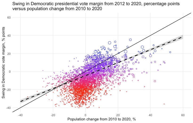
I shared the following graph of the relationship between county-level population change and swing in Democratic presidential vote share in last Saturday’s subscribers-only thread:
Today I want to dig into this a bit more, mainly by showing the data relative to 2008 levels too.
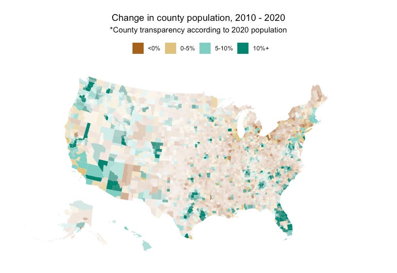
But first, some context. Points on a graph are fun and all, but what are we really looking at? Here is my recreation of the Census Bureau’s graph of which counties gained or lost population from 2010 to 2020. Note the broad decline in rural areas, especially in the northeast, as well as some former manufacturing hubs (Detroit pops out):
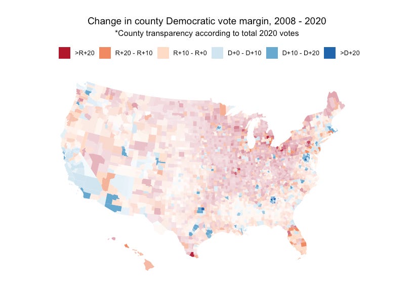
And here’s a map of where the Democratic presidential vote share increased or decreased relative to 2008 levels. We see a similar decline in rural areas, but also the Hispanic-heavy counties of Texas, Florida and New Mexico. (There’s also a weird discontinuity along the eastern Pennsylvania-Maryland border. Could be my data provider.)
After posting last week’s issue, several of you asked to see the scatterplot between population change and presidential vote swing from 2008 to 2020. So here you go:
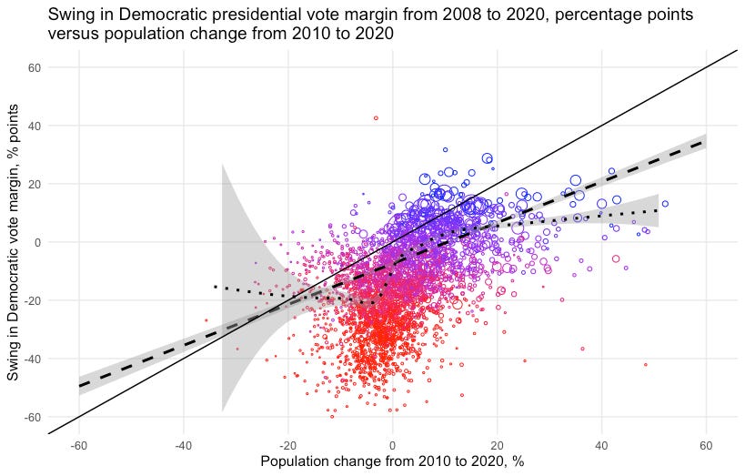
There is actually a slightly flatter relationship between population and votes here than in the 2012-2020 plot. What givess? I suspect a lot of it has to do with the increase in racial polarization that happened between 2008 and 2012, which this map does not capture but the former scatterplot controls for.
Here’s what this looks like if we group the counties by growth decline instead of plotting them as points. This really hightlights the large shift towards Republicans in rural counties.

Another hypothesis worth testing is that the places in America that got whiter from 2010 to 2020 also got more Republican. This would be true, roughly speaking (NB: handwaving away the ecological fallacy) if individual vote choice became more correlated with race between 2008 and 2020. While that’s true in most survey data I’ve seen, and you can see a general positive slope here, there are a few noticable exceptions.

The first exception is counties that got much whiter. I don’t know why this is. Perhaps it’s because they also tend to be older, and Joe Biden did comparatively well with the olds last year. Or maybe it’s something else. The second exception is the noise in polarization by population growth around the third and fourth deciles. These buckets include the Hispanics counties in Florida and South Texas and the black belt counties in the Deep South that got more diverse but also drag around the average change in Democratic vote share.
I thought these would be fun to share and that you would get something out of them. Spy something interesting? A potential lead for a story? Flag it in the comments.
PS: I make these charts by aggregating the Census Bureau’s PL 94-171 block-level redistricting enumerations for both 2010 and 2020 up to the county level and then merging on the results of the last 4 presidential elections, downloaded from here.
What are you primarily using for viz these days? Is it mostly GGplot and D3.js?