It's time to ditch polling averages that don't also show uncertainty
The polls are tight in Georgia — and that's all we can really know
AFTER the election, pollsters and savvy (ie, empirical) political journalists spent a lot of time arguing that polls weren't actually THAT, wrong, but rather, our expectations for them have been set far too high. It seemed that election handicappers and forecasters might have even come around to the idea that this was partly our fault for not constantly emphasizing the inherent errors in polling and forecasting. Maybe the next time around, we could do so properly.
But now, with nearly two months of new election commentary available for analysis, the evidence suggests that that was too optimistic a view. Forecasters have apparently fallen into their same old habits of underplaying uncertainty in the polls.
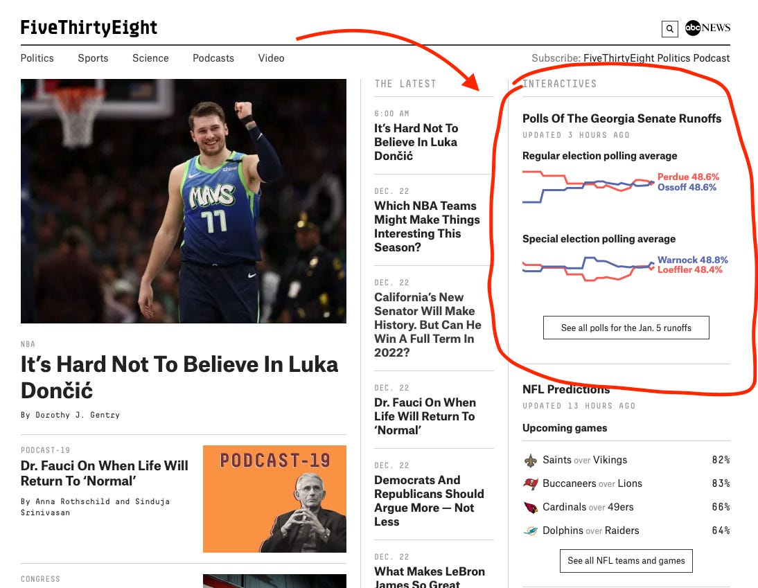
If you navigate over to FiveThirtyEight's home page right now, you'll see what I mean. Their polling average for the upcoming US Senate runoffs in Georgia are shown in a sidebar on the right side of the page, consisting of lines for each candidate and predicted vote shares — to one decimal point — for each candidate. See here:
This is virtually identical to how Nate Silver and his colleagues displayed their polling averages in the November general election.
This is all a bit puzzling — if Nate has concluded that people don't really understand the true scale of error in the polls, why isn't he adapting his visualization to fit that purpose? Maybe he doesn't really care; it's almost Christmas and I'm sure he has better things to do. But if we're really trying to take uncertainty seriously (perhaps so we can avoid undeserved chastising from readers and other pundits — see: November 3rd, 2020), then we should consider some improvements on this presentation.
One thing 538 could do (which is what I did in the general election) is to put margins of error around the averages. We know that the average final polling error in a Senate race is something around 5 percentage points on margin, with a confidence interval approaching 12 points or so. Surely adding upper and lower bounds for each candidate would help people actually understand the contest better?
Or maybe 538 could take a page out of the Washington Post's book and ditch the mini line-chart altogether and instead draw a lollipop plot with a range for each candidate percent and margin of error.
I like this approach because it would not only better convey the uncertainty in the average, but it would also downplay the minor changes to them that happen over time. They are largely the result of sampling and non-sampling error in the data, anyway.
...
The way 538 is covering the Georgia polls is an old, outmoded, and maybe even misleading way of covering the polls. Since we have already acknowledged that there is a problem in how we are conveying our un/certainty about pre-election polling (or, at the very least, the way the public understands the issue), it seems like a natural step to fix our most obvious errors — and sooner, rather than later.


